Toronto User Experience / Interaction Design / HCI Groups

All of IxDA Toronto‘s email comes to me, and I’d say a good 75% of it is from newcomers to the city, recent grads, or people investigating a career change. Everyone wants to know what UX resources are available in Toronto.

I respond to each query personally, but it has occurred to me that it would be good to have this kind of information up on the web – who knows how many people don’t think to email me, and go on unaware of all the great groups that meet in the city? How tragic.

So, here’s the list:

  • IxDA Toronto – the Toronto chapter of the Interaction Design Association(Since I help run it, I get to put it first.) :)IxDA Toronto meets roughly every month. We have no formal membership (absolutely everyone is welcome, whether they are an interaction designer or not), and events are always free. We try to have a nice mixture of workshops, panels, lectures, social events, and weird things like “Mentorship Speed Dating”.  We try to focus more on the design side of UX, but we really cover the full spectrum. After each event, we invite everyone to carry on the conversation at a local bar.To join: Register on the IxDA website, go to the IxDA Toronto page, and click “Join This Local” to get email notification of events, or follow us on Twitter.
  • TorCHI – the Toronto chapter of the ACM‘s special interest group on Computer-Human Interaction (SIGCHI)TorCHI runs a monthly lecture series focused on HCI topics, and they occasionally bring well-known UXers into town to run workshops. TorCHI’s presenters are a combination of leaders from industry as well as academia. They usually meet at the Bahen Centre at the University of Toronto.To join: Purchase a membership online. Says the website: “One year membership is CAD $20 and gets you free admission to our monthly events.  ACM Members can join for $15/year and students for $10.”
  • UXIrregulars – a long-running social group for UX professionalsUXIrregulars is currently run by Kaleem Khan. It meets the second Tuesday of every month (a little less frequently when Kaleem gets busy) at a local restaurant / bar. Everyone is welcome – it’s a great place to chat with people in the Toronto community. I love pointing out that I got my first job through UXIrregulars!To join: Find out about events through the Google Groups mailing list.
  • UX Practice Group – an interactive UX training seriesBrad Einersen founded the UX Practice Group a year or two ago. He takes fledging (and more experienced) UX designers through a series of free tutorials about practical UX skills, like usability testing and creating personas. Events are held at Brad’s offices at Klick.To join: Sign up for the UXPG LinkedIn Group to be notified of events.


Any of these groups would be pleased to have you attend an event – please don’t be shy. If you have any questions (or ideas of any groups I’ve missed), let me know in the comments!

Omnigraffle Annotation Scripts Posted

After much delay, I finally got around to prettify-ing and posting the scripts I created to help me adjust my wireframe annotation dots in Omnigraffle.

Rather than copying yet another Usability Matters blog post over here, I’ll simply point you to the blog post:
Annotation (“Wireframe Dot”) Applescripts for Omnigraffle

I still have yet to write scripts for better managing the textual half of annotations in Omnigraffle… whenever I think I have an approach, Applescript throws up a barrier. But if people find these useful, perhaps I’ll prettify the ones I wrote for Visio back in the day as well (they are numerous).

I’d love any feedback you have – hopefully they are not too difficult to use. I may do a video tutorial at some point if they are tricky.

Apple’s Checkout: Credit Card Flaws

(Originally posted on the Usability Matters Blog on December 22, 2009.)

Every week I collect a bunch of recommended reads in my browser tabs, hoping for a few spare minutes to skim through them. This week, one such article was Luke Wroblewski‘s blog entry, The Apple Store’s Checkout Form Redesign.

I really enjoy how straight-forward Luke is with his analysis in this article (and everything he writes, his book being no exception). He includes fantastic examples from Apple’s previous checkout form and its new checkout form. However, having just purchased a MacBook online, I have to disagree with his positive assessment of Apple’s new credit card form.

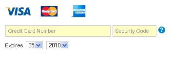
The form is as follows (note I’m using the Canadian form here so it’s missing the Discover card):

As Luke explains, Apple no longer asks users to identify their card type (Visa, MasterCard or AmEx) up front. Because we can infer a person’s card type based on their credit card number, all we really need is that number.

This is absolutely true. We have been asking people to enter unnecessary information for years. However, the problem is exactly that: people are used to entering this information.  So when we get to Apple’s form, we eagerly look for a place to identify our credit card.

My brain while using the form: “Lo! Look at those shiny images showing card types! I will click on Mastercard, for that is my card type.

A re-enactment, in pictures:

And then:

Then, the loud sigh. I gave up and started typing my credit card number in. And then the form did this:

All other cards are greyed out, and my card type was magically highlighted.

I am sure that Apple included the card type images as a way of telling users what cards they accept, but the images seem clickable because they are a) images and b) in a place where the user would normally expect to interact.

If I were to redesign this form, I would let users interact with the images if they want to. Let them select MasterCard up front if it makes them happy, but switch to Visa in the end if that’s the type of card number they enter. Users who choose to identify their card up front will be happy, and users who don’t identify their card up front won’t know what they missed.

Anyone else have an opinion on this?

(Thanks to LukeW for the inspiration to write about this issue.)

Designing Online E-Book Readers

(Originally posted on the Usability Matters Blog on November 6, 2009.)

I have heard more about digital books in the past six months than ever before! CBC’s Spark (one of my favourite radio shows) has recently discussed the future of books,  the concept of open text books, Harlequin’s approach to e-books, and the Toronto Public Library’s Digital Bookmobile, which promotes the library’s e-book collection. CBC’s Ideas also recently ran The Great Library 2.0, a documentary about Google Books’ massive digitization project as well as its “competitor”, the Open Content Alliance. I’d highly recommend a listen.

After hearing e-books swirling through my podcasts, it was exciting to get the chance to work on an e-book reader interface. If more and more content is being digitized, it’s going to be critical to have good interfaces to help find these books, and to read through them.  Usability Matters is currently helping Ontario Council of University Libraries (OCUL) design a tool for doing just that. Over the course of the last year, we have helped OCUL run regular exploratory and evaluative user studies to better understand student and faculty needs with regards to e-books as well as online journal articles.

Part of our work has been to look at various online e-book readers (allowing books to be viewed with an internet browser on a desktop computer). Most online readers are nothing special, but when I encountered the Internet Archive‘s newest reader (released in April 2009) I did a double-take. This was the first e-book reading experience that actually felt fairly comfortable to me. The question is: why? I’ll look at an example using an old Eaton’s catalogue to explore more.

ia_ebook_reader_eatons_catalogue

Although there is a lot worthy of discussion on this page (some positives and some negatives, in my opinion) there are two features that stand out:

1. Ease of Paging Through the Book

Moving from page to page in the book is done simply by clicking on either facing page. Click the right page to move forward in the book, and the left back to go backward. This is a huge improvement over other online tools I’ve seen, as it uses direct manipulation, instead of forcing you to use paging arrows in a corner of the interface. (Note that this tool has paging arrows available as well — giving users options, and ensuring users who don’t discover directly clickable pages can still navigate the book.)

This “click to flip a page” mechanism is strong on its own, but is augmented by an animation of the page actually flipping over. One might argue this animation is unnecessary, but I find it provides a very strong sense of place: it is an elegant way of providing feedback to the user that their action was completed correctly.

2. Browsing Through the Book

The trouble with many online book readers is their precision. You must go through the book linearly, page by page, or else enter a page number to jump to directly. For me, however, a key activity when I pick up a book (particularly a non-fiction book) is flipping through it, getting a sense of its structure and content.

This reader is the first I’ve discovered that makes this browsing activity possible on the computer. Note that much like a regular book, you can see the edges of pages behind the pages you’re reading. You can mouse over these page edges, and flip to a different section of the book. You can’t go to a specific page this way, but you could flip roughly to the middle of the book, or close to the end. The lack of precision is the charm here. I of course could type a random number into a “Go to page” widget at the top of the page, but that takes work: both work to type, and work to come up with a random number. In this interface, I just click randomly. I love it.

ia_ebook_reader_eatons_catalogue_flip_pgs

The movement of these pages also helps create a sense of place for the user as they read the book. They can tell at a glance that they are halfway through the book, instead of having to process a series of page numbers (like “page 63 of 194”).

One of the most interesting things about my love for these interface elements is the fact that the eight users we studied were either uninterested in or ambivalent towards a two-page view of a book. This is likely because they are reading in an academic context, whereas my goal with the tool so far has been to browse interesting old books. Still, I am extremely curious how they will react when they see this version, and if it will change their minds about the merits of facing-page e-book designs. I’ll let you know how it goes!

The Design of Personal Security Questions

(Originally posted on the Usability Matters Blog on March 13, 2010.)

Personal security questions on websites have been de rigueur for quite a while now.

You know what I’m talking about. You answer some personal questions (à la “What was the name of your best friend’s aunt’s dog in kindergarten?”) on sign-up. Later on, if you forget your password to that website, you can reset your password by answering those questions.

Let’s stop and think about that for a second. Answers to a few personal questions are a direct path to your password on certain sites. (Is anyone else getting chills yet?)

Like passwords, personal security questions are an area where security and usability collide head-on. Attempts to make something more secure can often result in making it less usable. Unfortunately, all too often, sites fail on both counts, compromising both usability and security.

Let’s review some of the most common problems with personal security questions, and how to improve your use of them.

Usability Problems

Questions are not specific enough.

  • Example: “What is your pet’s name?”
  • How it can fail: Which pet? What if you have three cats, a boa constrictor, and five chickens in the yard?
  • Improvements: Ensure the question is as specific as possible, with only a single possible answer. This is still far from ideal, but one option here would be asking “What is your cat’s name?” or “What was the name of your first cat?”.

Answers to questions change over time.

  • Example: “What is your favourite colour?”
  • How it can fail: Favourites are pretty fluid things. It’s hard to remember what your favourite colour might have been when you signed up for that site. My favourite while I was at university was red, but now I’m quite partial to teal.
  • Improvements: Avoid questions about favourites entirely. If users have already answered questions about favourites, tell them the date when they answered the question.

Users don’t have an answer to the question.

  • Examples: “Where did you go on your honeymoon?” or “What was your kindergarten teacher’s last name?”
  • How it can fail: Not all questions will be suitable for all users. Many people aren’t married or didn’t honeymoon; others cannot remember their teacher’s name from when they were 5.
  • Improvements: Never force a user to answer a specific question — always give a wide variety of options, and think carefully about how many will be applicable to different sets of people (young people, middle-aged people, older people, single people, married people, people from other cultures, etc.).

Users provide answers that aren’t easily repeatable.

  • Examples: “What street did you live on when you were 10?” and “What high school did you attend?”
  • How it can fail: Although these are nice and specific, users may write an answer in one format when registering, and provide it in another format when challenged at a later date. Did I write “Main St.”, “Main Street” or “Main St”? Did I write “Stoneybrook High”, “Stoneybrook” or “Stoneybrook High School”?
  • Improvements: Try to avoid questions for which you can foresee repeatability issues, and, if you do use them, remind users to pay attention to format.

Security Problems

Answers to questions are easily guessed.

  • Examples: “What is your eye colour?” and “How many children do you have?”
  • How it can fail: Hackers know the most common answers to questions and will try those first. It doesn’t take much to guess “blue”, “brown”, “hazel” and “green”.
  • Improvements: Avoid questions where the answer is likely to be highly guessable.

Answers to questions are easily found online or in other public sources of data.

  • Examples: “What’s your birthday?” and “What high school did you go to?”
  • How it can fail: In the age of blogs, Twitter, and Facebook, a ton of information about you is available online. Beyond the most obvious data like your birth date (which most people would expect to be easy to dig up), it is easy to divulge something you think is private information but is actually easily accessible. This could be because you shared it online and forgot, or because someone else shared it online and you didn’t find out.
  • Improvements: Avoid these kinds of questions.

Improving Your Use of Personal Security Questions

  • Decide whether personal security questions are truly useful for your site. Would emailing a password reset link to an email address be sufficient for your needs? If you feel you must use security questions, try to avoid making them the sole gateway between a user and a password: instead combine them with some other security measure.
  • Always tell users the date they provided answers to their security questions.
  • Yahoo does this well:

yahoo_pvq_date_example

  • For instance, I planned to have my honeymoon in one city, but it got changed to a different city at the last minute. Knowing I answered the question in November instead of October makes all the difference in helping me answer the question correctly.
  • Consider implementing a CAPTCHA to prevent hackers from writing scripts to automatically guess answers.
  • Consider letting users fill in the blanks to make stronger questions. Mike Just describes this in his paper,Designing and Evaluating Challenge-Question Systems. Provide a question such as, “What is _______’s favourite food?” and let the user fill in a person of their choice.
  • Consider using an alternative challenge and response approach. In his paper, Personal knowledge question for fallback authentication, Ariel Rabkin describes using images, e.g.  having users upload a picture and asking “What is the first name of the person in this picture?”. Other possibilities also exist.
  • If letting users write their own questions, give adequate guidance. Remind them:
    • To choose something very memorable (something they’ll still remember the answer to in 3 years).
    • To choose something that is fixed over time (favourites come and go, as do pets).
    • To choose something that is not easily guessable, particularly numerical answers. For instance, there is a fairly fixed set of answers to the questions “How many children were in your family?”.
    • To choose something that is not published online or in public records.
    • To try to choose something only they know the answer to. (This is extremely difficult. In lieu of this, encourage them to choose different types of questions, such that no one person knows or can find answers to all of the questions. Remind them that the person trying to get into their account could very well be someone they know.)
    • Why it is important to choose questions with secure answers (i.e. what the consequences are if someone manages to answer the questions correctly).
    • To not panic. Presenting all of this info and instructions can be overwhelming and scary.  Too much detail about security issues might be pretty discouraging. (And here’s the heart of the interaction designer’s challenge in this area – inform, but only enough.)

Sources and Additional Resources

If you’re responsible for the design of a personal security question system, I strongly encourage you to read (1) and (2) below – between them, Ariel’s and Mike’s papers cover everything I’ve talked about and more. (3) and (4) are more general-interest articles.

  1. Personal knowledge question for fallback authentication: Security questions in the era of Facebook (PDF) by Ariel Rabkin(SOUPS, July 2008).
  2. Designing and Evaluating Challenge-Question Systems (PDF) by Mike Just (IEEE Security & Privacy, 2004).
  3. Those Crazy Internet Security Questions by Kate Pickert (Time Magazine, September 24, 2008).
  4. ‘Forgot your password?’ may be weakest link by Bob Sullivan (MSNBC, August 26, 2008).

As always, I’d love to hear your thoughts on this topic.